
Forums · Attention all artists! Now taking suggestions for potential analyses layouts!
If you are an artist or simply a user of photoshop, please read.
Alright, well now that the Analyses Revamp format is established, and now that we finally have the revamps themselves underway, we need to establish an acceptable layout for our work.
To put it bluntly, we need to make this-
http://www.libelldra.com/community/forums/topic/4013/salamence-revamp/
-look pretty.
After talking it over with Fantasty, we've pretty much decided that we don't have any criteria regarding the aesthetic details of the layout, other than it look "cool," lol, so you pretty much have all the artistic freedom you would require.
There are a few formatting issues that you have to consider however. I'll just list them for you in a pretty basic manner:
1.) The Analyses are going to be in tab format. This means there will be a "main" page, and tabs on that main page corresponding to the sets for that Pokemon.
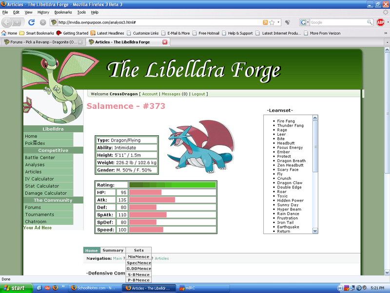
2.) The main page will include the Pokedex entry #, Pokemon name, Pokemon picture, "basic info," and the Defensive Combinations section.
3.) Basic info includes base stats, height, weight, ability, typing, and Pokedex entry text (this is just for "pleasure purposes"). If there is anything else you feel is necessary, please be feel to include it, but remember, this is just basic info. Also, please try and exclude any other Pokedex relevant information, like location, EXP growth rate, etc., as all of that will be included in the Pokedex section of this site.
4.) Once a visitor to the site clicks on one of the set tabs, he will then be taken to that set page. The set page will still have the Pokedex entry #, Pokemon name and Pokemon picture, but the basic info will be replaced by the Set section's information.
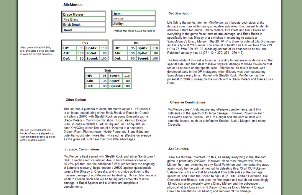
5.) The Defensive combinations will be replaced by the Set Description, Other Options, Offensive Combinations, Strategic Combinations and Set Counters sections, in that order.
6.) Finally, the last of the tabs will be the Summary tab, which again will keep the Pokedex entry #, Pokemon name and Pokemon picture, but will replace all other information with the General Counters and Putting it All Together sections.
To summarize, you can think of this as essentially designing three parts: the main page, the set page, and the summary page.
Other than that, you have all the leeway you would want.
If you would like to participate in this, please post in this topic!
To put it bluntly, we need to make this-
http://www.libelldra.com/community/forums/topic/4013/salamence-revamp/
-look pretty.
After talking it over with Fantasty, we've pretty much decided that we don't have any criteria regarding the aesthetic details of the layout, other than it look "cool," lol, so you pretty much have all the artistic freedom you would require.
There are a few formatting issues that you have to consider however. I'll just list them for you in a pretty basic manner:
1.) The Analyses are going to be in tab format. This means there will be a "main" page, and tabs on that main page corresponding to the sets for that Pokemon.
2.) The main page will include the Pokedex entry #, Pokemon name, Pokemon picture, "basic info," and the Defensive Combinations section.
3.) Basic info includes base stats, height, weight, ability, typing, and Pokedex entry text (this is just for "pleasure purposes"). If there is anything else you feel is necessary, please be feel to include it, but remember, this is just basic info. Also, please try and exclude any other Pokedex relevant information, like location, EXP growth rate, etc., as all of that will be included in the Pokedex section of this site.
4.) Once a visitor to the site clicks on one of the set tabs, he will then be taken to that set page. The set page will still have the Pokedex entry #, Pokemon name and Pokemon picture, but the basic info will be replaced by the Set section's information.
5.) The Defensive combinations will be replaced by the Set Description, Other Options, Offensive Combinations, Strategic Combinations and Set Counters sections, in that order.
6.) Finally, the last of the tabs will be the Summary tab, which again will keep the Pokedex entry #, Pokemon name and Pokemon picture, but will replace all other information with the General Counters and Putting it All Together sections.
To summarize, you can think of this as essentially designing three parts: the main page, the set page, and the summary page.
Other than that, you have all the leeway you would want.
If you would like to participate in this, please post in this topic!
I'm definitely willing to help on this project. Though I won't be very active within the next ten days as I have finals and whatnot to take care of first. I'll see if I can get some communication going on IRC about specifics and aesthetics even though I know you said it's unrestricted in general.
Here is what I think the layout should look like.
Here is the current Rough Draft of the layout, made by Zero and Fantasty.
http://invidia.ownpurpose.com/analysis3.html#
And here's my version of how I think it should look like,
http://i110.photobucket.com/albums/n84/CrossDragonZX/PhotoshopAnalysis.png
Beware as this may contain Spoilers. >_>
Here is the current Rough Draft of the layout, made by Zero and Fantasty.
http://invidia.ownpurpose.com/analysis3.html#
And here's my version of how I think it should look like,
http://i110.photobucket.com/albums/n84/CrossDragonZX/PhotoshopAnalysis.png
Beware as this may contain Spoilers. >_>
I like Cross's idea for the Sets.
I'm not too keen, however, on the placement of the three boxes.
I would assume the people are going to read our analyses from the top down, and from the left to the right.
With that premise in mind, I would assume that the "first" thing people see, the top left most thing, is the Pokedex # and Pokemon name, which are fine. However, the "next" thing should be the Pokemon picture, not the basic info box.
I would recommend switching the Picture and basic info box and lowering the Learnset box, so it is "lower" than the picture.
[QUOTE USER="Aldaron" TIME="1212158627"]I like Cross's idea for the Sets.
I'm not too keen, however, on the placement of the three boxes.
I would assume the people are going to read our analyses from the top down, and from the left to the right.
With that premise in mind, I would assume that the "first" thing people see, the top left most thing, is the Pokedex # and Pokemon name, which are fine. However, the "next" thing should be the Pokemon picture, not the basic info box.
I would recommend switching the Picture and basic info box and lowering the Learnset box, so it is "lower" than the picture. [/QUOTE]
I was just going to suggest that, I could have Salamence on the left, and the Info Box on the right with the base stats box remaining where it was. But when I did it, being the manga reader I am, I always tend to look from Right to Left.
[QUOTE USER="CrossDragon" TIME="1212205945"][QUOTE USER="Aldaron" TIME="1212158627"]I like Cross's idea for the Sets.
I'm not too keen, however, on the placement of the three boxes.
I would assume the people are going to read our analyses from the top down, and from the left to the right.
With that premise in mind, I would assume that the "first" thing people see, the top left most thing, is the Pokedex # and Pokemon name, which are fine. However, the "next" thing should be the Pokemon picture, not the basic info box.
I would recommend switching the Picture and basic info box and lowering the Learnset box, so it is "lower" than the picture. [/QUOTE]
I was just going to suggest that, I could have Salamence on the left, and the Info Box on the right with the base stats box remaining where it was. But when I did it, being the manga reader I am, I always tend to look from Right to Left.
[/QUOTE]
Ok, I tried that. And it really doesnt look as neat. And I have a habit to make things look really fricking organized. So that's a no go for that idea.
I'll let you guys decide the main page and the heading, so I'm just going to start off with the set page layout.
http://i230.photobucket.com/albums/ee131/menofuntall/Misc/setlayout.png
Personally, when you only have one column, it makes the analysis look kind of stunted.
EDIT: And here's a version that aldaron told me to make.
http://i230.photobucket.com/albums/ee131/menofuntall/Misc/setlayout2.png
Yeah, looks better to me.
Here are some samples of a quick idea I had, which wasn't necessarily so quick when I started making it...
http://img.photobucket.com/albums/v253/ChinchillaDragoon/libelldraLayout_main.jpg
http://img.photobucket.com/albums/v253/ChinchillaDragoon/libelldraLayout_sets.jpg
http://img.photobucket.com/albums/v253/ChinchillaDragoon/libelldraLayout_summary.jpg
http://img.photobucket.com/albums/v253/ChinchillaDragoon/libelldraLayout_main.jpg
http://img.photobucket.com/albums/v253/ChinchillaDragoon/libelldraLayout_sets.jpg
http://img.photobucket.com/albums/v253/ChinchillaDragoon/libelldraLayout_summary.jpg
Another idea I had. I personally think this one is more polished looking than the previous MS paint-y looking one.
http://img.photobucket.com/albums/v253/ChinchillaDragoon/libelldraLayout_main2.jpg
http://img.photobucket.com/albums/v253/ChinchillaDragoon/libelldraLayout_sets2.jpg
http://img.photobucket.com/albums/v253/ChinchillaDragoon/libelldraLayout_summary2.jpg
http://img.photobucket.com/albums/v253/ChinchillaDragoon/libelldraLayout_main2.jpg
http://img.photobucket.com/albums/v253/ChinchillaDragoon/libelldraLayout_sets2.jpg
http://img.photobucket.com/albums/v253/ChinchillaDragoon/libelldraLayout_summary2.jpg
http://i110.photobucket.com/albums/n103/FunkethElf/Libelldralayout.png?t=1217279533
My attempt, I thought having the Defensive Combonations on the Basic Info page looked weird, so I made a tab for it. I'll probably do the other pages later or tomarrow. But in it the only thing that changes is the center area, Leaving the name, number, typing, evolution, and picture always there.
My attempt, I thought having the Defensive Combonations on the Basic Info page looked weird, so I made a tab for it. I'll probably do the other pages later or tomarrow. But in it the only thing that changes is the center area, Leaving the name, number, typing, evolution, and picture always there.